democracy_gdp_2020 <- read.csv("../data/democracy_gdp_2020.csv")Week 8: Linear Regression I
POP88162 Introduction to Quantitative Research Methods
Scatterplot
As with correlation we will start by looking at the scatterplot showing the joint distribution of regime longevity and GDP per capita in 2020.
Download and read in the CSV file containing the data for these two variables called democracy_gdp_2020.csv. Remember, you will need to change the file path to the one that is correct for your computer.
As we covered in the lecture, scatterplot is the easiest way to show how two interval-scale variables relate to each other. We already used plot() function before.
plot(democracy_gdp_2020$democracy_duration, democracy_gdp_2020$gdp_per_capita)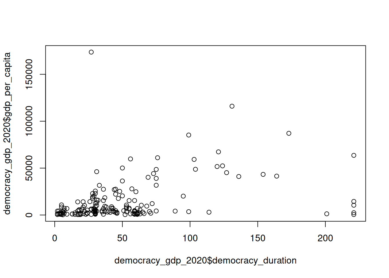
Linear Regression
To fit a linear regression model in R we use lm() function. Its two main arguments are formula and data. While data simply expects the name of the data frame which contains variables used in the analysis, formula provides a flexible interface for specifying different models in R and is used across a wide range of functions for statistical modelling.
In its most basic form formula follow a Y ~ X syntax with the name of the dependent variable being on the left-hand side of the ~ and one or more names of independent varable(s) on the right.
Let’s revisit the example we looked at in the lecture. Here we are fitting a bivariate (i.e. with only one independent variable) regression model with country’s GDP per capita as an outcome (dependent variable) and the longevity of its political regime as an explanatory (independent) variable.
lm_fit <- lm(gdp_per_capita ~ democracy_duration, data = democracy_gdp_2020)Here we saved the fitted model object under the name lm_fit. Now we can use summary() function to print out detailed model output.
summary(lm_fit)
Call:
lm(formula = gdp_per_capita ~ democracy_duration, data = democracy_gdp_2020)

Residuals:
   Min     1Q Median     3Q    Max
-44806  -8756  -4944   4820 163717

Coefficients:
                   Estimate Std. Error t value Pr(>|t|)
(Intercept)         5051.44    2370.78   2.131   0.0345 *
democracy_duration   182.22      35.15   5.185 5.99e-07 ***
---
Signif. codes:  0 '***' 0.001 '**' 0.01 '*' 0.05 '.' 0.1 ' ' 1

Residual standard error: 20900 on 173 degrees of freedom
  (20 observations deleted due to missingness)
Multiple R-squared:  0.1345,    Adjusted R-squared:  0.1295
F-statistic: 26.88 on 1 and 173 DF,  p-value: 5.995e-07
What do these numbers tell you? What is a null hypothesis and an alternative hypothesis for this test? What is your decision regarding a null hypothesis given the output above?
Plotting Linear Regression
Now let’s go back to our scatterplot and add a regression line showing fitted values to it.
plot(democracy_gdp_2020$democracy_duration, democracy_gdp_2020$gdp_per_capita)
abline(lm_fit, col = "deepskyblue4", lwd = 2)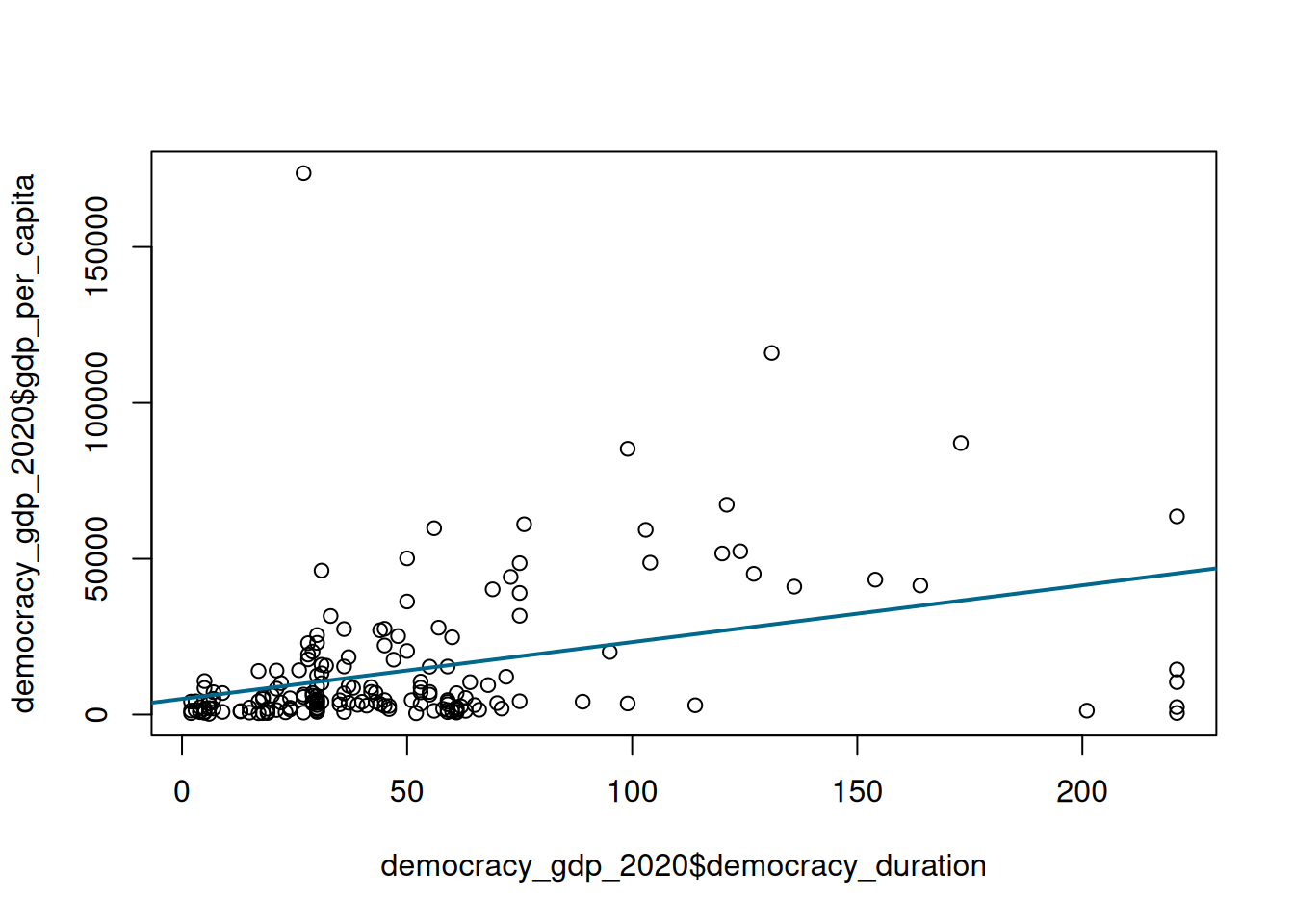
Here we are adjusting the default colour using col argument and default line width using lwd argument. For additional plotting facilities see help documentation ?abline and ?par. This cheatsheet provides an exhaustive list of colour names understood by R.
Now, go back to the original democracy_gdp_2020 dataset. Split it into two separate data frames, the one for democracies and the one for autocracies. Use democracy variable for it. Fit the same linear regression model with GDP per capita as a dependent and regime longevity as an independent variable separately for each dataset. What are the estimates of the regression coefficients in each case? How do the two compare to each other? What is your decision regarding a null hypothesis in each of the two cases?
Create two scatterplots, one for autocracies and one for democracies, and add a regression line from a corresponding model to each of the plots.
Plotting Confidence Intervals for Linear Regression
Modify the previous scatteplots by adding confidence intervals to them.